Brief:
To develop an infographic, based on any chosen topic, which highlights key information on the topic and presents data/statistics visually.
For this project I chose to explore the sports world in relation to graphic design. One key area of of sports related graphic design is the use of infographics as there is such a large range of statistics that recorded.
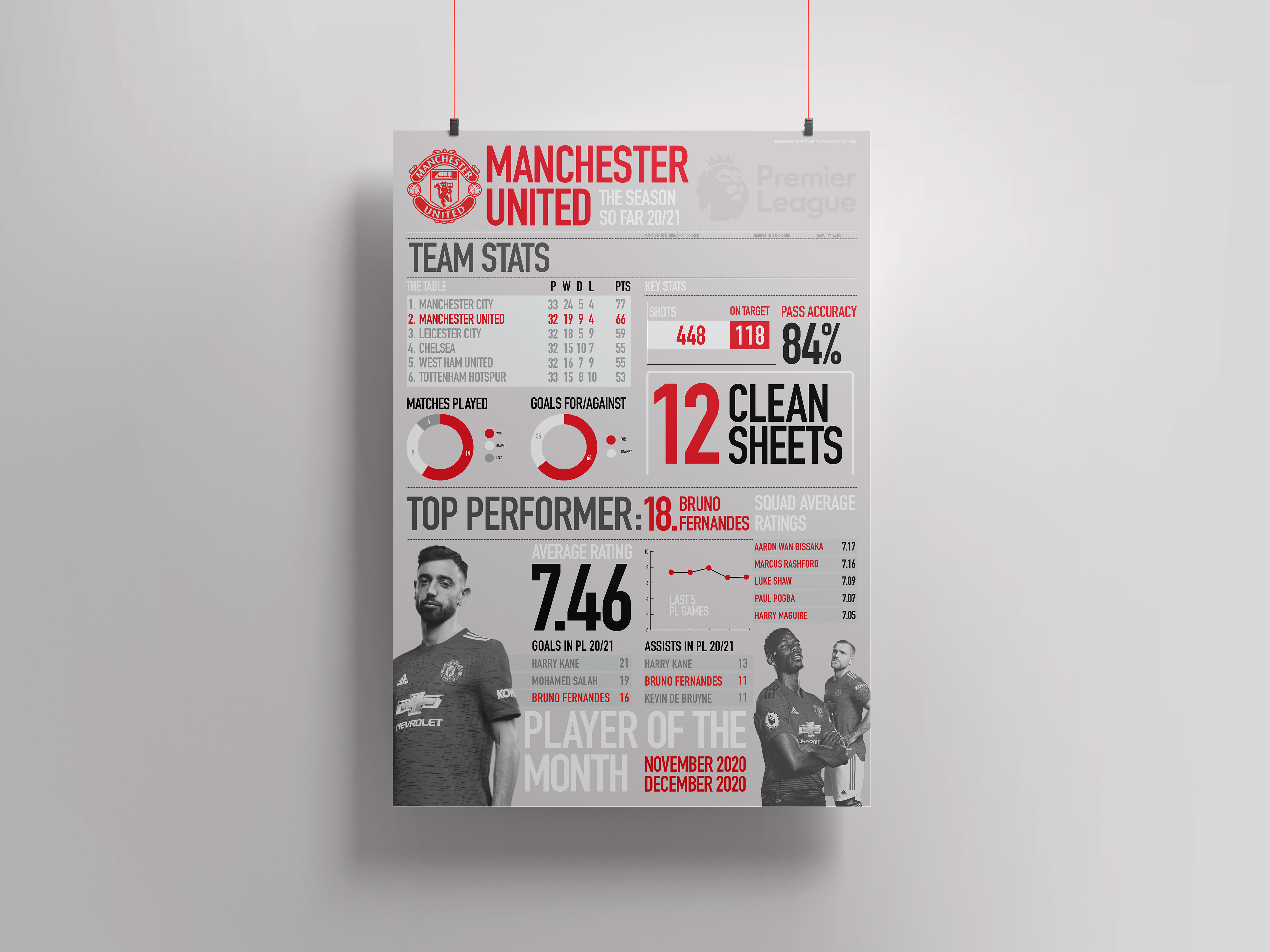
The idea for my infographic, would be a visual of the Manchester United's team performance entering game week 33. This also included looking at a number of the players individual performances at this stage of the season.
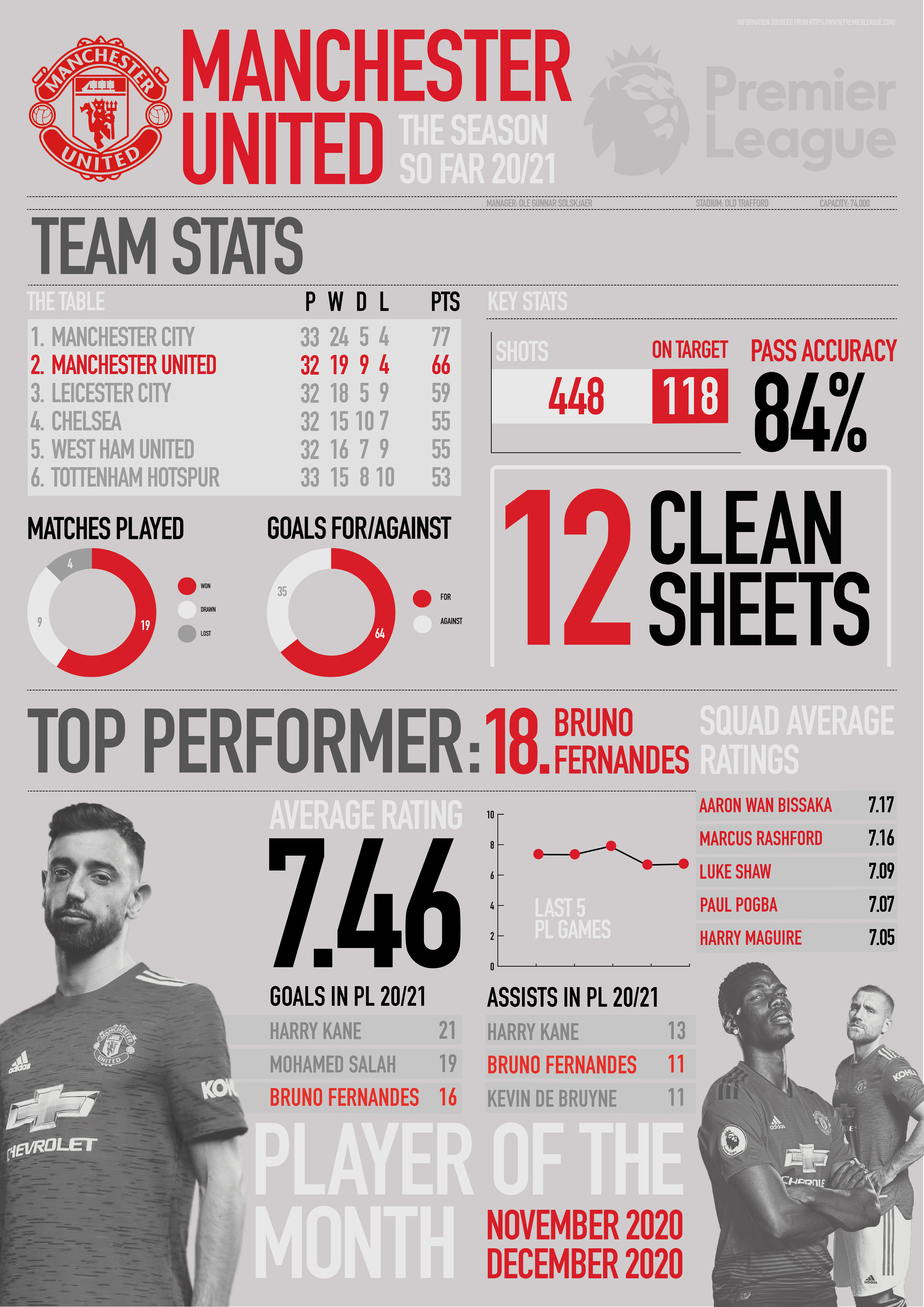
The layout of the poster is broken into parts, where the top half showcases the statistics of the team as a collective, and the bottom half highlights individuals’ performances. This allows the user to easily distinguish what they are looking at and select the information they require. Grayscale mages of the players in the bottom section provide a more aesthetically pleasing design while not being too overpowering of the main part of the design, the information, due to the restrained colour palette.
Inspired by Nicholas Feltron and J Alexander Diaz, larger, bold type has been used for single statistics, making them more memorable for the viewer and easier to recall. The use of the different graphs within the design also makes for the more complex or larger stats to be visualised by the viewer.
Overall, I believe the design produced works effectively as an infographic by it’s clear visualisation of statistics and through the the structured layout making the information easier to consume and recall.